

Level Up Your React Components with Dot Notation
Group and organize React components so you can compose like a pro!


Composability is one of the things that makes React so gosh darn great.
If you're scratching your head at 'Composability', it just means we can wrap and combine components that themselves can wrap and combine with other components to compose (see what I did there?) a brand new component.
Because React is so flexible - and uses so much native JavaScript - there are some very fun ways to handle composability that the React docs and most courses don't cover. One of my favorites is Dot Notation, and there are 2 different ways to enable this depending on your needs.
What are Dot Notation React Components?
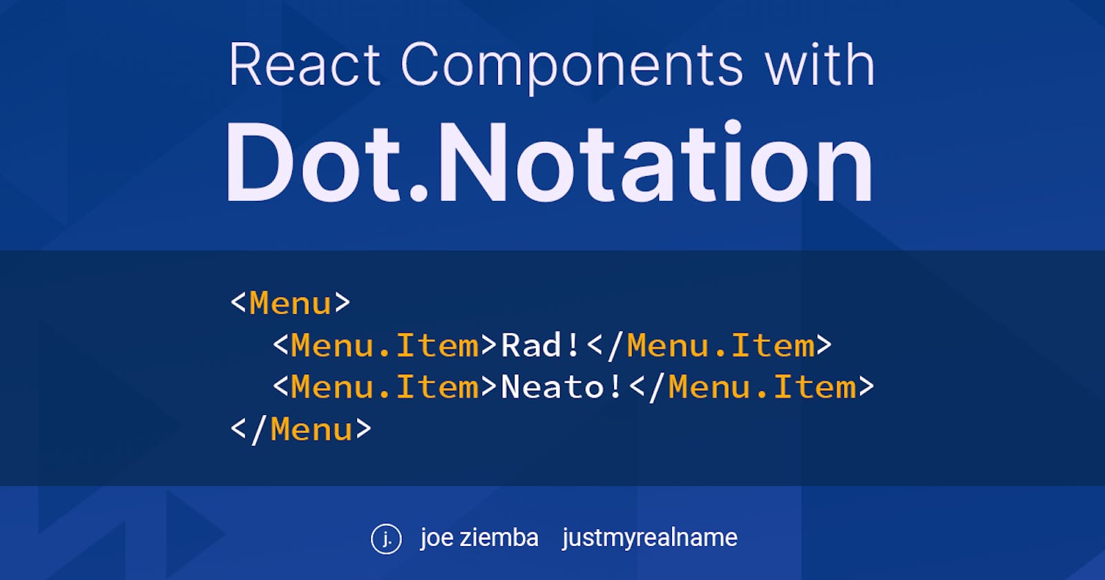
You may have seen this pattern before in component libraries, and possibly been wowed by the fanciness:
import { Menu } from "fancy-menu"

const SubNav = () => {
  return (
    <div>
      <Menu>
        <Menu.Item>Stuff</Menu.Item>
        <Menu.Item>Things</Menu.Item>
      </Menu>
    </div>
  )
}

No Frollo, JavaScript!
The dot notation pattern can be incredibly useful for organization and content control. We can bundle many related components into one, reducing our import statements and our cognitive overhead of remembering what components go together. Under the hood, we can also enforce some specific rules around what can be done with them.
Implementing Dot Notation React Components, Part 1
Despite it's fancy appearance and relative infrequent use, dot notation is pretty simple to implement. Here's the basic structure:
// fancy-menu.js

// First define the child component. The one that comes after the dot.
const Item = ({ children }) => {
  return <div className={classes}>{children}</div>
}

// Then define the Parent as a class
// Yes, a class. Not sorry, function purists
export class Menu extends React.Component {
  static Item = Item // Magic words for dot notation!

  render() {
    return <div className={classes}>{this.props.children}</div>
  }
}
Now we can import just the Menu and get all it's children for free! This is great for components that have parent/child relationships and will always be used in a hierarchy.
Let's say we want to be stricter with Menu, and only accept Menu.Items as children. That way users of our component can't pass other elements and break our beautifully-planned layout. To enable that, we can use the React.Children API.
React.Children is a utility React gives us to access a components children as an array - something we can't do with regular props.children. We can map through our children now, checking their types and throw an error if there's anything unwelcome.
export class Menu extends React.Component {
  static Item = Item

  render() {
    return (
      <div className="">
        {React.Children.map(this.props.children, (child) => {
          if (child.type !== Item) throw new Error("None of that please")

          return child
        })}
      </div>
    )
  }
}
From here we could even add multiple child components for more complex layouts, using React.Children to render them each in different locations. There are a lot of possibilities, including a whole different way to get dot notation!
Implementing Dot Notation React Components, Part 2
The second way of getting dot notation has 2 big differences:
- Uses a barrel export instead of class component
- Base object isn't usable itself
This method of dot notation is great for logically grouping related components without worrying about their explicit parent/child relationships. As an example, imagine we want some generic components for building layouts. Having Row and Row.Column could work, but it feels...weird. And later on, if we add other layout pieces like a divider, header, or block quote that could go inside a column, they wouldn't fit the Row. naming well
It would make more sense to group these into a category and use them as Layout.Row, Layout.Column, Layout.Header, and so on.
// components/Layout/Row.js
export const Row = () => {
  /* implementation */
}

// components/Layout/Column.js
export const Column = () => {
  /* implementation */
}

// components/Layout/index.js
import Row from "./Row"
import Column from "./Column"

export default { Row, Column }

// anywhere else
import Layout from "components/Layout"

const Component = () => {
  return (
    <Layout.Row>
      <Layout.Column>First Column!</Layout.Column>
      <Layout.Column>Second Column!</Layout.Column>
    </Layout.Row>
  )
}
The base Layout in this method isn't a usable component itself, instead it just provides a logical and extensible container. To bypass the container declaration, we can destructure the import to get right to what we need:
// anywhere else
import { Row, Column } from "components/Layout"

const Component = () => {
  return (
    <Row>
      <Column>First Column!</Column>
      <Column>Second Column!</Column>
    </Row>
  )
}
Component organization is a beautiful thing!
You may have noticed 'components/Layout' there is not a normal relative path. If you want to know how to enable that little bit of magic, check out my last post on absolute imports in react.
If you like these patterns give the post a like, and leave a comment if you try them out or have other great patterns! For more React and JavaScript tips, subscribe to my blog and follow me on Twitter @justmyrealname